There is no doubt that web designing is a skill that requires complete involvement and may even take an entire lifetime to master. To make matters more complicated, this is a field that is constantly evolving every passing moment. And with the world still recovering from the COVID-19 pandemic, a lot of things may have changed forever, for better or for worse!
In a time, where a website may be the only rational tool for you to reach your potential audience, perfecting your website design has become extremely crucial in today’s economic climate. But you already know this. The question that remains, however, is how you can improve your web design in 2021 so that you don’t fall behind!
According to a special report produced by Datareportal in July 2020, the online activities and digital engagement have increased exponentially as compared to what it was before and at the start of the COVID-19 lockdown stage. Now if the current pandemic marketing updates are anything to go by, then this is high time that you focus on improving your website in every way possible to gain the most benefit out of the situation.
Table of Contents
Taking a quick look first
You may think that these updates are the least of your concern right now, but if the 2020/2021 data analysis of the market is anything to go by, this could be the reason behind the success or failure of your website in 2021.
So how do you make sure that the amazing content and services you have to offer don’t go unnoticed because of flaws in the design? Keep reading to know.
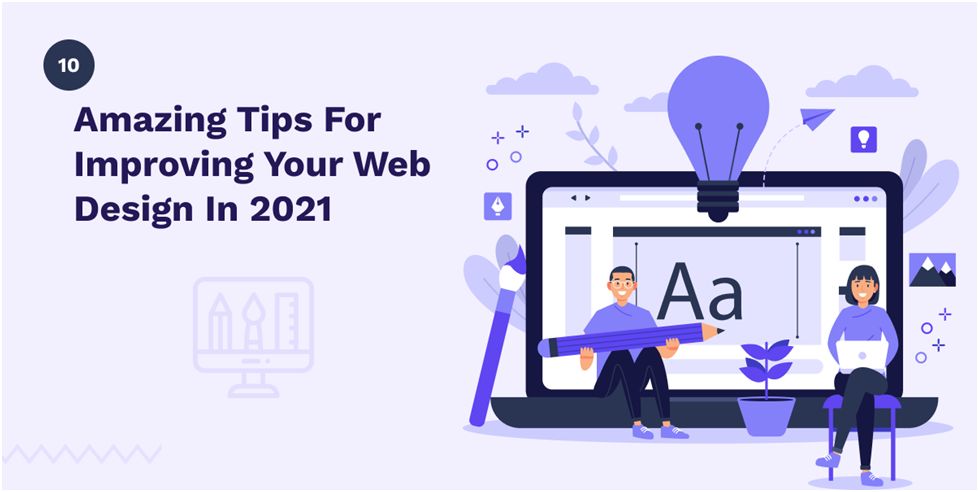
10 Best Tricks to Improve your Web Design
Refresh the Basics
Now, this cannot be emphasized enough! The secret to any great web design is the basics. The foundations of your basics not only help you better understand your requirement but also communicate that to the professional who will be building your page.
Few of the basic ideas that will give you a good start are:
- Creating a plan and sticking to it
- Steering clear of the cluttered screen
- Prioritizing site speed
Trying to find experts according to your need, for instance, a UX designer may be able to provide better solutions to the users while you may also connect to a Top web development company for solving your client’s problems.
Once you have your basics cleared out and have a crystal-clear idea of your requirement, half the work is done. Now what’s left is building a website design that stands out based on research on what will work the best.
Focus on Site Speed
Gandhi may have said, “There is more to life than simply increasing its speed.” But that isn’t valid when it comes to your website. According to research, speed is one of the crucial factors that impact everything, whether it is bounce rate or user experience, or conversions. In simple words, if your website is slow, your visitors are not going to stick around. Also, search engines take into account the loading speed of your website when determining ranks.
Now you can find tons of guides on the internet regarding why website performance is important for your business, and how you can improve it. But no matter which path you choose, you just cannot ignore the site speed factor when you are trying to build, improve or renovate your website.
Use the Fold to Your Advantage
Many may argue about the relevance of the fold today like it doesn’t matter anymore. But if we are to believe the research done by a leading global computer user interface and user experience consulting firm, the Nielsen Norman Group, then the relevance of the fold wasn’t diminished even in 2018.
In fact, according to that study, users spent about 57% of their page-viewing time above the fold, while 74% was spent in the first two screenfuls. These statistics seemed to also contradict their own study in 2010, which stated that the average user spent 80% of the time searching for information only above the page fold.
See how the trend keeps changing?
Therefore, using a clear and definitive headline that elaborates and highlights the benefits that your site offers to the visitors can be of great help.
Including a call-to-action button will increase the chances of conversion. Visually stimulating content, such as images, videos, charts, graphs, and even audio content will help establish your point.
Learn from Hick’s Law
There is a simple idea that states that the time your user will take to reach a decision is directly proportional to the number of choices you provide them with. This is also known as Hick’s Law or Hick-Hyman Law and it warns you about flooding your users with too many options.
Hick’s Law loses its significance when you’re working on long lists, such as a contact list, or a UX design topics list. But when it comes to shorter lists, such as the navigation menu, or action button on your website or app, this is extremely valuable to follow.
It’s quite simple:
- Keep the number of menu items to a minimum
- Keep a tab on the form fields
- Prioritize call to action
- Display only the social network buttons where you are most active
So basically, in 2021, you need to reduce the clutter and get on with some spring cleaning on your website.
Keep in Mind – Less Is More
This concept is not new! A vast study by Google was published on the subject that elaborates on this. Turns out that visual complexity is repulsive to the visitors, so minimalistic designs should be your goal in 2021.
Sounds simple? You can stick to the 80/20 rule, also known as the Pareto principle, that is not just applicable to your website design, but is followed by all businesses in general as a rule of thumb. So if you feel unsure about where to start, take a hint from the industry leaders on this.
Use Shorter Sentence Construction
The same principle of “less is more” is also applicable to the content of the website. Instead of cluttering your visitors with a lot of text, why not mix it up? Use a simple sentence. Then maybe use a longer sentence to explain or create a variety in the paragraph.
See what I did there?
Along with shorter sentences, or a combination of short and long sentences, you can also use shorter paragraphs to keep your audience hooked. Don’t get it wrong! Sometimes, facts and statistics may require you to use longer paragraphs to establish your point. But let’s not overuse it. Too much of anything, after all, is not good.
Use a CTA That Is Clear, Concise, and Familiar
Did you know that most websites don’t even have a CTA button that you can spot within three seconds! In fact, the number of websites that properly do this is very low! This is a major flaw in the design of your website.
The idea is to keep the texts very minimal on the screen, so your message is clear through the CTA.
Now where you need to put it may depend on your page and will be different for every page. But if your message remains the same, then your CTA needs to be so as well.
The best way to figure this out is to think from the viewer’s perspective and how they will navigate through your website.
The White Space Is Your New Best Friend
Believe it or not, the white space is actually an essential part of your design element and it helps you break up the page, increase readability, and enhance the overall visual communication with your audience.
Another fun fact here; white space necessarily doesn’t have to be white and it can be of any color, texture, or even contain a background image.
The white space or negative space also allows you more flexibility in positioning your website elements. It can be used to separate sections, create the visual guideline, and fill the entire page within your viewport without cluttering too many sections.
Prioritize Mobile Optimisation
According to this recent Digital 2020 Global Overview Report published by Hootsuite, the majority of the internet accessing population of the world does so through mobile. Quite naturally, if your website is not optimized for mobile view in 2021, it’s not going to give a good performance.
Focus more on the “mobile responsiveness” of your site and figure out how well the images appear on the mobile devices to give users a more pleasant experience while navigating. This is going to be different from the desktop version of your site since mobile devices have many new design guidelines and controls like the swiping function.
Strategic Color Scheme and Optimized Typography
Color and typography are two of the aesthetic elements of your web design that will make your site visually stand out from the rest. Do it right, and it can work magic for your brand!
When you know how to use your white space properly, you will have a good idea about “composition” too.
Now you can focus on color, which is a powerful tool in any design. Strategically choose a color scheme that is in sync with the emotional connotation that your brand represents.
Similarly, typography includes all the visuals of how your texts are represented. So focus on fonts, size, text color, and style. Even the spacing between the letters, words, and lines can play a big role in how your brand is going to be viewed.
Closing Remarks
Are you keen on maximizing your user experience, and offer more to your customer through your website? Now that you have gone through all the 10 best web design tips relevant in 2021, let’s get this clear. It’s one thing to understand the concept, and it’s entirely another thing to apply them effectively to your site. Subjects like color therapy, typography, and composition require more in-depth study and expertise. Mobile responsiveness is an entirely different subject altogether.
If you intend to focus on digitally claiming your position as a strong contender, then this is the right time to hire the best web designers to work on updating your website.

Harikrishna Kundariya, a marketer, developer, IoT, ChatBot& Blockchain savvy, designer, co-founder, Director of eSparkBizTechnologies. His 8+ experience enables him to provide digital solutions to new start-ups based on IoT and ChatBot.