
Do you know that about 48% of daily internet access happens through Mobile Devices? In the digitalization era, this is one of the biggest and self-evident truths that most people access the internet through mobile devices.
We cannot deny that our life has been surrounded by mobile phones, and we all are dependent on mobile devices for our daily activities. From setting our morning alarm to booking a cab or ordering food online – all these activities are done through mobile phones.
What do stats say? According to a recent mobile app development stat, the number of mobile users worldwide is forecast to grow to 7.33 billion by 2023. By looking at the growing users of mobile devices, it becomes necessary to optimize the site for mobile devices.
Well, it becomes essential to follow some practices in mind while developing your mobile presence. Through this write-up, I will describe some of the best practices you can use to optimize websites for mobile devices.
So, without wasting any more, let’s dig in!
Why is mobile optimization important?
The number of mobile users is increasing with each passing day; there are approx 3 billion people in the world with smartphones. Hence, it becomes crucial for your website to work well on mobile devices, so if you have not yet invested in making your website mobile-friendly, the time has come to do so.
Here are some reasons why your mobile presence is vital to your business:
- If your site is not mobile-friendly, then visitors are five times more likely to leave.
- Mobile-friendly websites appear more in search results.
- Mobile searches account for more than half of searches on the search engines.
- For many advertisers, the majority of traffic comes from people on their mobile phones.
The next few years will see a tremendous increase in phone usage as technology has become cheaper. If your website is not mobile-optimized, Google will not rank your site higher.
About 67% of users are more likely to buy from a mobile-friendly company? If your website works smartly on mobile devices, your visitors will be more likely to purchase your products.
Thus, it is a better idea to hire mobile app developers in India; they will help you earn more conversions for your business by making your website mobile-friendly.
What are the Ways to Optimize the Website for Mobile Devices?
Now that I have made it clear why it is necessary to design your website for mobile devices let’s get a little more practical. In this section, I will tell you some of the profound aspects of optimizing websites for mobile devices. Let’s start!
#1: Consider Mobile Device While Designing
The website is primarily built to serve desktop users and is featured on a beautiful full-screen display. But looking at the massive usage of mobile devices, now it’s time to adapt to the concept of mobile-first design.
The website is primarily built on the principle of serving desktop users and is featured on a beautiful full-screen display. But mobile devices are a thing, and it is time to adapt to the concept of mobile-first design.
What design elements should you use in your mobile-first design?
Content first: You can do some interesting things with mobile design, but not within the realm of desktop design. So, first, give way to the content of the site. Make other content parts easily readable and accessible. A mobile screen is far less forgiving of distracting visual elements.
Prioritization: Mobile phone screens are limited to the available display space. Besides, the mobile screen vertically presents content as opposed to a much broader horizontal structure for the desktop. This means that you have to design using priority.
Easy navigation: On a mobile device, you cannot click anywhere and return to the homepage. Unless, of course, you plan this type of navigation ahead of time. Experiment with scroll-to-top widgets whenever possible.
#2 Redefine your design aesthetics
Consumers today expect a lot from sophisticated mobile design. The advent of mobile phones has fueled the growth of design-focused organizations such as Apple and Google. In less than a second, people make adverse decisions about your product if you haven’t designed your site well.
On the other hand, if you have a nicely designed site, people perceive that you take the equal care of your products as well. Do not forget to pay attention to typography as the right font can make or break your site’s conversion rate.
#3 Make Your Website Responsive
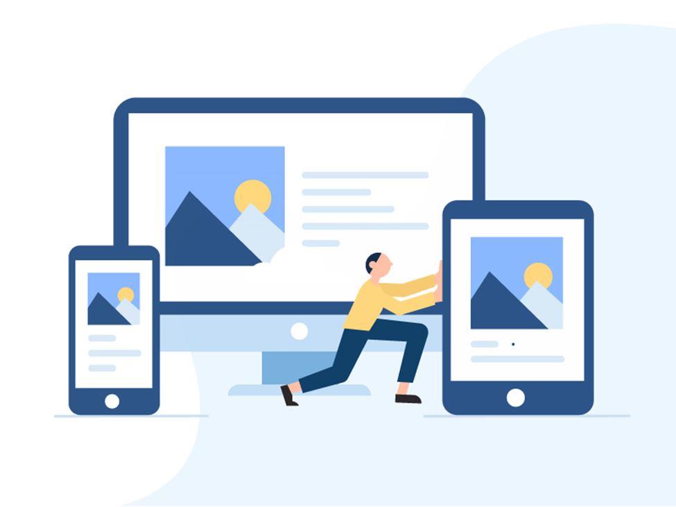
What is a responsive site? This is a site where the design element resizes regardless of what device, browser, and screen size it’s viewed to give users a great visual and browsing experience.
If you’re running a WordPress website, making it responsive can be as simple as installing the right theme. However, you must ensure that the given theme is responsive before installing it. If not, ask your web developer to implement Google’s guidelines for responsive web design.
#4 Test Site Using Google’s Mobile-Friendly Utility
Before moving further, you should see how your site is ready for mobile-friendliness. By doing this, you will be able to improve particular areas of your website that you need to work on and will provide valuable information on how you can improve.
One way to do this is to use your website on many different devices. Visit the site using your smartphone, and see how it feels to use. Doing this will let you know how efficiently the design works on small screens.
After doing this, you can even go deeper using a testing tool. Thanks to Google, it has created a tool that can be used for free. It is called as a mobile-friendly test tool and it shows if your site is up to its standards for mobile pages.
#5 Improve Your Site’s Loading Time
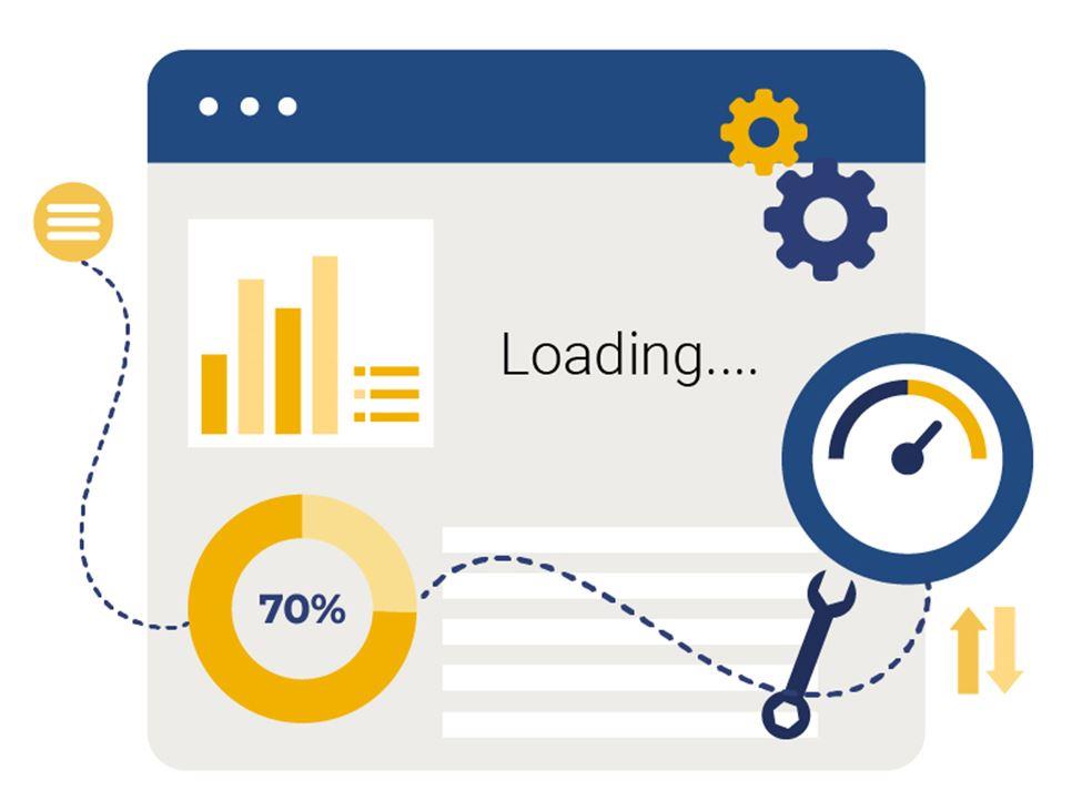
The most important metric is the loading time of your site. Modern users want a much faster and swift web experience. According to a survey, 40% of web users will abandon a page if it takes more than three seconds to load.
It is always an important consideration to keep the loading time of your site to a minimum. Slow page speed means fewer page views, decreased customer satisfaction, and lower conversions. By optimizing the site speed, you keep your bounce rates down and thus improve user experience.
However, when you are optimizing a site for mobile users, performance becomes a top-notch priority. The “speed update” by Google made the site’s speed a ranking factor for mobile pages.
To improve Google page speed, you need to diagnose the cause for the slow running of sites to enhance speed.
#6 Redesign Pop-Ups for Mobile Devices
Pop-ups are one of the most effective ways to grab a user’s attention. If your site has strategically designed pop-ups, they tend to increase conversion rate or pass useful information to users.
However, this can cause problems when viewing websites on mobile devices. Screen space becomes more important on smaller devices, even medium-sized pop-ups can become more unmanageable.
To put a stop on pop-ups that harm the user experience, Google has recently imposed some penalties on the pop-up. These are a set of rules that pop-ups must follow not to disappoint mobile users or cover too many sites. You need to ensure that your mobile pop-ups follow those guidelines.
#7 Enable Accelerated Mobile Pages (AMP)
You should join the AMP movement to make mobile surfing a great experience. What is AMP exactly? Basically, it is a process of creating mobile-friendly versions of the pages of your site.
AMP versions will be given to users who access your website via mobile device. Now, many sites are using AMP to ensure that their mobile versions work at peak performance.
Naturally, AMP has a lot to offer, including specially created versions of your site’s HTML and JavaScript files. Fortunately, you do not need to understand all the technical details to take advantage of this technique.
#8 Select a Reliable Web Host
Selecting the right web host for your site is one of the most important decisions to take. If a host does not provide you with the speed and resources you need, nothing can prevent your website from performing poorly.
Your web host will determine how well your website performs. Speed is utmost important when it comes to mobile-first optimization. Choosing a host that keeps your website up to speed will significantly help with your site’s mobile-friendliness.
So, keeping this fact in mind, you must select a plan that can guarantee consistently high performance. In most cases, the best option is running with a VPS hosting plan, as they are affordable and offer outstanding performance all the time.
#9 Use Mobile Redirects
Once your site is designed and ready to go, make sure to put redirects to a place where visitors will inevitably visit when using a mobile device and direct him to a mobile-optimized version of the site.
Once you are redirected, any mobile user who types in your web address or clicks on a link in the search engine will be sent to a mobile-optimized version of your site.
Conclusion
Now we live in a mobile-first world. Most Internet users rely more on mobile devices than their desktop counterparts, which means that you should carefully consider how your website works and look on the small screens.
Optimizing your site so that it performs well and is easily usable on mobile devices is the need of an hour. So, keeping all the above pointers in mind, you can contact the mobile app development company in India as they can help you by optimizing websites for mobile devices.
Thanks for reading this article. You can subscribe for regular update about technology news and tips via RSS Feed.